Fitting a polynomial to a set of points by Mark Seemann
The story of a fiasco.
This is the second in a small series of articles titled Trying to fit the hype cycle. In the introduction, I've described the exercise I had in mind: Determining a formula, or at least a piecewise function, for the Gartner hype cycle. This, to be clear, is an entirely frivolous exercise with little practical application.
In the previous article, I extracted a set of (x, y) coordinates from a bitmap. In this article, I'll showcase my failed attempt at fitting the data to a polynomial.
Failure #
I've already revealed that I failed to accomplish what I set out to do. Why should you read on, then?
You don't have to, and I can't predict the many reasons my readers have for occasionally swinging by. Therefore, I can't tell you why you should keep reading, but I can tell you why I'm writing this article.
This blog is a mix of articles that I write because readers ask me interesting questions, and partly, it's my personal research-and-development log. In that mode, I write about things that I've learned, and I write in order to learn. One can learn from failure as well as from success.
I'm not that connected to 'the' research community (if such a thing exists), but I'm getting the sense that there's a general tendency in academia that researchers rarely publish their negative results. This could be a problem, because this means that the rest of us never learn about the thousands of ways that don't work.
Additionally, in 'the' programming community, we also tend to boast our victories and hide our failures. More than one podcast (sorry about the weasel words, but I don't remember which ones) have discussed how this gives young programmers the wrong impression of what programming is like. It is, indeed, a process of much trial and error, but usually, we only publish our polished, final result.
Well, I did manage to produce code to fit a polynomial to the Gartner hype cycle, but I never managed to get a good fit.
The big picture #
I realize that I have a habit of burying the lede when I write technical articles. I don't know if I've picked up that tendency from F#, which does demand that you define a value or function before you can use it. This, by the way, is a good feature.
Here, I'll try to do it the other way around, and start with the big picture:
data = numpy.loadtxt('coords.txt', delimiter=',')

x = data[:, 0]
t = data[:, 1]
w = fit_polynomial(x, t, 9)

plot_fit(x, t, w)
This, by the way, is a Python script, and it opens with these imports:
import numpy
import matplotlib.pyplot as plt
The first line of code reads the CSV file into the data variable. The first column in that file contains all the x values, and the second column the y values. The book that I've been following uses t for the data, rather than y. (Now that I think about it, I believe that this may only be because it works from an example in which the data to be fitted are 100 m dash times, denoted t.)
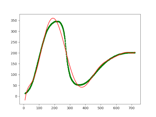
Once the script has extracted the data, it calls the fit_polynomial function to produce a set of weights w. The constant 9 is the degree of polynomial to fit, although I think that I've made an off-by-one error so that the result is only a eighth-degree polynomial.
Finally, the code plots the original data together with the polynomial:

The green dots are the (x, y) coordinates that I extracted in the previous article, while the red curve is the fitted eighth-degree polynomial. Even though we're definitely in the realm of over-fitting, it doesn't reproduce the Gartner hype cycle.
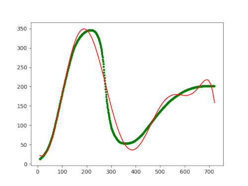
I've even arrived at the value 9 after some trial and error. After all, I wasn't trying to do any real science here, so over-fitting is definitely allowed. Even so, 9 seems to be the best fit I can achieve. With lover values, like 8, below, the curve deviates too much:

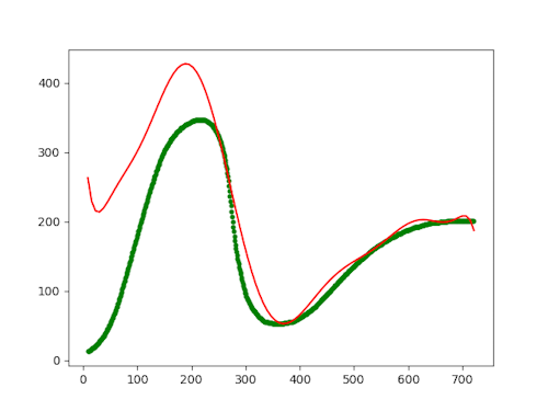
The value 10 looks much like 9, but above that (11), the curve completely disconnects from the data, it seems:

I'm not sure why it does this, to be honest. I would have thought that the more degrees you added, the more (over-)fitted the curve would be. Apparently, this is not so, or perhaps I made a mistake in my code.
Calculating the weights #
The fit_polynomial function calculates the polynomial coefficients using a linear algebra formula that I've found in at least two text books. Numpy makes it easy to invert, transpose, and multiply matrices, so the formula itself is just a one-liner. Here it is in the entire context of the function, though:
def fit_polynomial(x, t, degree):
    """
    Fits a polynomial to the given data.

    Parameters
    ----------
    x : Array of shape [n_samples]
    t : Array of shape [n_samples]
    degree : degree of the polynomial

    Returns
    -------
    w : Array of shape [degree + 1]
    """

    # This expansion creates a matrix, so we name that with an upper-case letter
    # rather than a lower-case letter, which is used for vectors.
    X = expand(x.reshape((len(x), 1)), degree)
    return numpy.linalg.inv(X.T @ X) @ X.T @ t
This may look daunting, but is really just two lines of code. The rest is docstring and a comment.
The above-mentioned formula is the last line of code. The one before that expands the input data t from a simple one-dimensional array to a matrix of those values squared, cubed, etc. That's how you use the least squares method if you want to fit it to a polynomial of arbitrary degree.
Expansion #
The expand function looks like this:
def expand(x, degree):
    """
    Expands the given array to polynomial elements of the given degree.

    Parameters
    ----------
    x : Array of shape [n_samples, 1]
    degree : degree of the polynomial

    Returns
    -------
    Xp : Array of shape [n_samples, degree + 1]
    """

    Xp = numpy.ones((len(x), 1))
    for i in range(1, degree + 1):
        Xp = numpy.hstack((Xp, numpy.power(x, i)))
    return Xp
The function begins by creating a column vector of ones, here illustrated with only three rows:
>>> Xp = numpy.ones((3, 1))
>>> Xp
array([[1.],
       [1.],
       [1.]])
It then proceeds to loop over as many degrees as you've asked it to, each time adding a column to the Xp matrix. Here's an example of doing that up to a power of three, on example input [1,2,3]:
>>> x = numpy.array([1,2,3]).reshape((3, 1))
>>> x
array([[1],
       [2],
       [3]])
>>> Xp = numpy.hstack((Xp, numpy.power(x, 1)))
>>> Xp
array([[1., 1.],
       [1., 2.],
       [1., 3.]])
>>> Xp = numpy.hstack((Xp, numpy.power(x, 2)))
>>> Xp
array([[1., 1., 1.],
       [1., 2., 4.],
       [1., 3., 9.]])
>>> Xp = numpy.hstack((Xp, numpy.power(x, 3)))
>>> Xp
array([[ 1.,  1.,  1.,  1.],
       [ 1.,  2.,  4.,  8.],
       [ 1.,  3.,  9., 27.]])
Once it's done looping, the expand function returns the resulting Xp matrix.
Plotting #
Finally, here's the plot_fit procedure:
def plot_fit(x, t, w):
    """
    Plots the polynomial with the given weights and the data.

    Parameters
    ----------
    x : Array of shape [n_samples]
    t : Array of shape [n_samples]
    w : Array of shape [degree + 1]
    """

    xs = numpy.linspace(x[0], x[0]+len(x), 100)
    ys = numpy.polyval(w[::-1], xs)

    plt.plot(xs, ys, 'r')
    plt.scatter(x, t, s=10, c='g')
    plt.show()
This is fairly standard pyplot code, so I don't have much to say about it.
Conclusion #
When I started this exercise, I'd hoped that I could get close to the Gartner hype cycle by over-fitting the model to some ridiculous polynomial degree. This turned out not to be the case, for reasons that I don't fully understand. As I increase the degree, the curve begins to deviate from the data.
I can't say that I'm a data scientist or a statistician of any skill, so it's possible that my understanding is still too shallow. Perhaps I'll return to this article later and marvel at the ineptitude on display here.

Comments
I suspect that increasing the degree wound up backfiring by effectively putting too much weight on the right side, whose flatness clashed with the increasingly steep powers you were trying to mix in. A vertically offset damped sinusoid might make a better starting point for modeling, though identifying its parameters wouldn't be quite as straightforward. One additional wrinkle there is that you want to level fully off after the valley; you could perhaps make that happen by plugging a scaled arctangent or something along those lines into the sinusoid.
Incidentally, a neighboring post in my feed reader was about a new release of an open-source data analysis and curve fitting program (QSoas) that might help if you don't want to take such a DIY approach.
Aaron, thank you for writing. In retrospect, it becomes increasingly clear to me why this doesn't work. This highlights, I think, why it's a good idea to sometimes do stupid exercises like this one. You learn something from it, even when you fail.